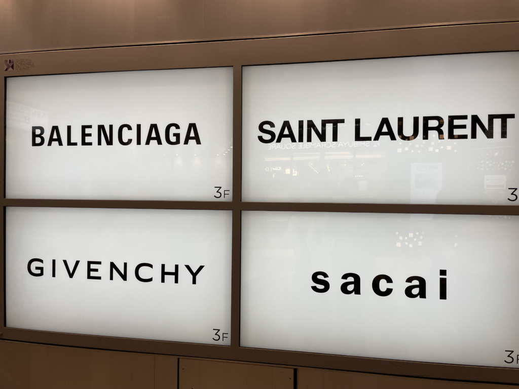
When I was in Tokyo last month, I walked past a department store near the Shibuya Scramble Square. I stopped and did a double take because I saw this:
It was a signboard showing a bunch of luxury brand logos. What struck me was how similar they look. I already have trouble differentiating luxury brands, and now their logos look exactly the same.
What’s interesting was that fashion logos didn’t look like this in the past. For example, take a look at what Balenciaga’s old logo looked like for almost 100 years from 1917 – 2013:
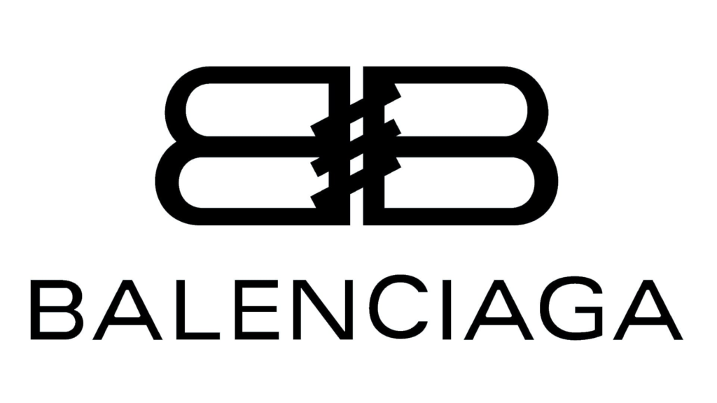
At least the old logo had a monogram, and the diagonal “stitches” gave me a clue that it’s a fashion brand. Compared to the old logo, the new, “modern” logo seems boring and lacking in personality. It says nothing about what the brand stands for. If an alien came to earth and saw the new logo on a wall, it would’ve forgiven it for mistaking it for a generic sign like “toilet” or “wet paint”.
It’s not just luxury logos either. Tech logos have also started to look the same. Here’s a great graphic from Velvetshark comparing how logos from tech and luxury fashion have evolved:
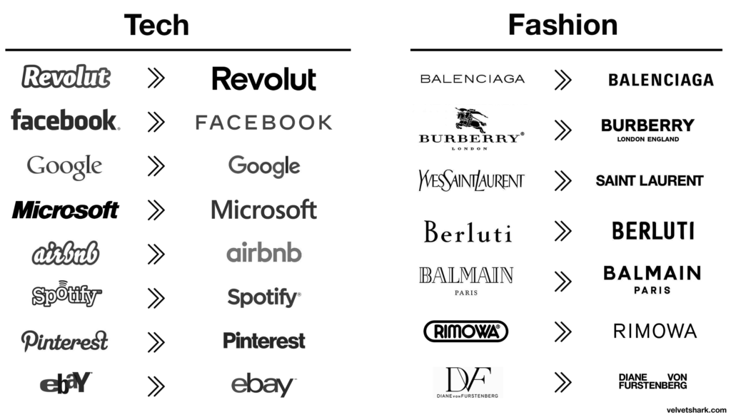
Everything seems to have evolved from having a unique personality to having the same boring sans serif font, at least for tech. Like my experience walking past that Tokyo department store, if I didn’t look closely I would have thought it was just a sea of undifferentiated text.
When writer David Perell tweeted about this trend, it caused a firestorm online. He argued that this homogenization is not just limited to logos, but also to fashion, writing styles, corporate identities, and architecture. Once I read it, I saw this trend popping up everywhere. For example, here are three showflats for recent new launch condos.
The Amo:

The Riviere:

Irwell Hill Residences:

All of them have the same hotel-like “modern luxe” aesthetic. It makes you feel like you’re in a business hotel chain. The design is safe, predictable, and appeals to large swathes of the Singaporean population.
What’s Causing Everything To Look The Same?
Velvetshark and David Perell suggested a few reasons why styles seem to be converging together:
- Readability: Sans serif is supposedly the easiest font set to read online. It can be scaled downwards to tiny mobile screens and upwards to huge billboards. So everyone adopts the same sans serif font in their logos.
- Technology: David Perell suggested that because all designers now use the same tools, those tools exert the same unconscious forces on their creative process. I’m not a designer so I’m not familiar with this, but our tools do exert unconscious forces on our work. For example, the default layout setting for a Google slide is the standard Widescreen 16:9 layout, so all presentations have this same setting.
- Mass Appeal: As brands grow larger, they want to appeal to a wider and wider spectrum of people. Therefore, they lose their distinctiveness towards a more neutral middle, which expands their addressable market. Perhaps this is the case for home interior styles. Having a McDonald’s-themed home might be a great conversation-starter, but makes your home much more difficult to sell especially if your buyers don’t like McDonald’s. So everyone adopts the same popular design aesthetics that would appeal to anyone.
I’d like to put forth an additional hypothesis on why everything looks the same: Mimesis
As a recap, mimetic desire happens because our own desires aren’t independent or autonomous. Instead, we want things just because others have them.My theory is that mimetic desire affects companies just as much as it affects people. Brands often want to become like other brands. This is strange, because the whole point of a brand is to help consumers distinguish your company over everyone else. Yet, think about how logo selection happens at a big corporate:
- The management committee gathers in a big conference room, where they fancy design agency they hired presents 3 options for their new logo.
- The first option is rejected because it looks too similar to the old logo.
- The second option is way too out there – it’s like nothing the committee has ever seen before, and they worry that it’ll be too much of a shock for consumers.
- So they go with the third option, which is an evolution of their current logo, but fits into current design trends: Clean lines, sans serif font, flat design. It’s not going to offend or shock anyone. Safe, predictable, and “on-trend”. But by definition, following a trend means following what others have already done.
Brands want to stand out, they just don’t want to stand out too much.
There is a trend in logo design that started around 2017-2018. It’s as if many companies decided that being unique was a handicap and that it was better to be like everyone else.
Velvetshark
The Consequences
Okay, so everything looks the same. What’s the big deal? I don’t know for sure, but here are my thoughts on three possible consequences:
The convergence of creativity: Variation inspires creativity. Creativity is simply the process of combining different styles and ideas from varied fields (or as one author so eloquently put it before, “letting your ideas have sex”). But if everything starts to look similar, then combining them makes them even more similar. Mixing red and green gives you yellow, but mixing crimson and pink gives you… some other reddish colour.
The narrowing of beauty: Similarly, I worry that our standards of beauty will also start to converge. While I believe that beauty is objective (e.g. Michelangelo’s Sistine Chapel is objectively more beautiful than my terrible attempts at sketching), the homogenization of everything might cause us to narrow our preferences for beauty towards specific styles. It’s like saying only work from Pollock is beautiful, while discounting Picasso, Van Gogh, Monet and Dali. The world becomes boring and one-dimensional.
The intensifying of competition: Looking alike necessarily means that everyone competes for the same audience. When there’s no more differentiation, everyone focuses on competing with each other instead of innovating. Peter Thiel warned about this in his book Zero To One : He cites the F&B industry as an example where competition is intense, everyone is undifferentiated, and profits get competed down to zero.
In Conclusion
The key, I suppose, is to test out being different and to be intentional about it. Even though we should’t be different just for its own sake, there is merit to being a little bit weird and quirky as a person, a corporation, or as a creator (do writers still count as “creators” these days?)
This is way more difficult than it sounds. Especially coming from a guy who has probably the most basic habits and tastes. (I can identify with Simon Cowell who once said, “I have average tastes”)
So, perhaps I need to find small ways to train myself to go against the grain a little. For example, instead of ending my post with a full sentence like everyone else, maybe I’ll end it with
